Customizing the Layout of Advanced Request Offerings (Portal version 6.0)
 Candice_Yeudall
Customer Advanced IT Monkey ✭✭✭
(Please note that I had started this in version 5 of the portal, but Cireson changed their coding in version 6 forcing me to redo all of it. So the code shown below will only work with version 6.)
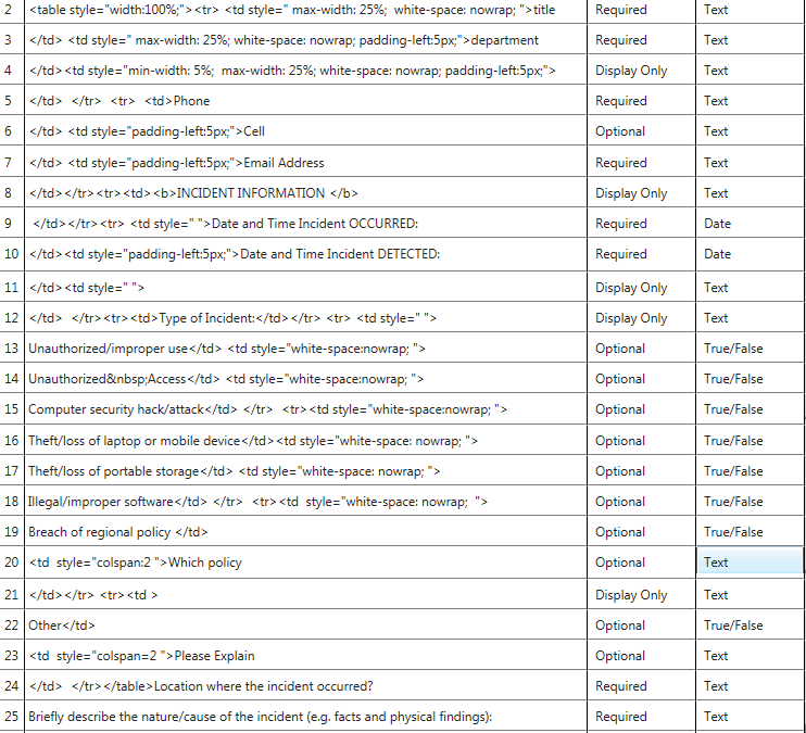
For anyone who is interested here is how I got my offering to have 3 columns instead of 1.


For anyone wondering about why I did my coding as I did here is a bit more in depth explanation:
</td> <td style=" max-width: 25%; white-space: nowrap; padding-left:5px;">department
- I closed the previous cell in this line so that the text box appears under Title
- I user the max-width so that each of my elements fit and I have some responsiveness to resizing
- white-space: nowrap is used to stop the text from wrapping too soon in the cell (if you play with the True/False you will see what I mean)
- padding-left:5px is used for the spacing between the text boxes
</td> </tr><tr><td>Type of Incident:</td></tr> <tr> <td style=" ">
Unauthorized/improper use</td> <td style="white-space:nowrap; ">
Unauthorized Access</td> <td style="white-space:nowrap; ">
Computer security hack/attack</td> </tr> <tr><td style="white-space:nowrap; ">
- When I move in to the True/False checkboxes you will note that I have moved the location of my coding, the row and cell tags are now in the row before the text - this is so that the checkbox appears before the text
Hope this helps some one.


Comments
Cireson could learn a thing or two from how good this looks. *hint hint*
The ability to format forms across multiple columns is a great idea I think.
Or even just the ability to group a bunch together an a fenced off area on the screen to keep like items together could be quite nice.
Also do remember that there is the ability to create Advanced Request Offerings across several pages so that can reduce the clutter quite a lot... But it is on another page... I know.
No I had not considered placing this as a request as Cireson already told me
james_kleinschnitz Cireson Dev, Product Owner, I took that to mean that Cireson feels that their customers are generally not looking to maximize the use of screen real estate and that having 50 check boxes each on their own line is acceptable. Knowing my user base there is no way they would do a from that extends that long.I have also noted that there are so many feature requests going in to Cireson that unless someone duplicates the request it tends to get lost very quickly and that the Cireson forum user base is having a very hard time finding and keeping track of what has been requested, by others.
I also feel that Cireson has to look at and deal with some of the major requests that have already been put forth i.e. watcher lists for requests. There is a point when it becomes useless to put in more requests for things especially when the people you are making the request to have already shown they have no plans to pursue the idea (as shown in quote above).
https://community.cireson.com/discussion/comment/2877#Comment_2877
and the full statement I made:
As for your concerns about feature request and particularity the "Watchlist" feature, @chris_ross has commented on that thread and has informed the community that is has been accepted and will get added to the product. https://community.cireson.com/discussion/220/allow-users-to-add-work-items-to-a-watchlist#latest
That's a lot of work - thanks for sharing. I agree - more compact forms are nicer.
Cheers Darryl
Eric,
I am not a web developer by any means, but based on some testing I have done in V 8.1.1.2016, this is either a lot more difficult than before or just can't be achieved anymore. It seems to get confused by the code that is embedded between the prompts, in my test of the above code I could only get it to display a multi prompt table on the left 50% of the offering. We did not actually test if the ticket could be submitted but I believe we would have run into the same issue as you. This I believe would be due to the amount of HTML ending tags that would then be placed inside the table rather than after it (again not a web developer so this is my best guess)
I did find that it is a useful way to provide a display only table which is relevant to the previous prompt. However, it will inherit the blue underline for the header row from the html which creates the "page" tabs if using an advanced offering.
Other testing I have done has been successful in creating the table across the whole width of the offering but I have not been able to find a solution to being unable to submit the offering when trying to put multiple prompts within the table.
That said, even if I did find a solution I don't know that I would implement it due to the fact a version upgrade seems likely to break what I have designed. Best of luck to you though.
Chris